Merhaba bu makalede css yardımıyla güzel butonlar nasıl oluşturabileceğimize örneklerle birlikte değinelim. Yapacağımız işlemler butonları renklendirmek, butonun içindeki texlerin ebatını ayarlamak, butonların ebatlarını ayarlamak, şekillerini ayarlamak.
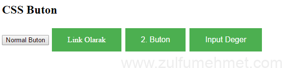
Örnek – 1 : Normal bir buton ve renklendirdiğimiz bir buton ve kullanma şekllerinden bahsedeceğiz
<!DOCTYPE html>
<html>
<head>
<style>
.button {
background-color: #4CAF50;
border: none;
color: white;
padding: 15px 32px; /* ebatları */
text-align: center; /* yaziyi ortalayak */
text-decoration: none;
display: inline-block;
font-size: 16px;
margin: 4px 2px;
cursor: pointer;
}
</style>
</head>
<body>

<h2>CSS Buton</h2>

<button>Normal Buton</button>
<a href="#" class="button">Link Olarak</a>
<button class="button">2. Buton</button>
<input type="button" class="button" value="Input Deger">

</body>
</html>
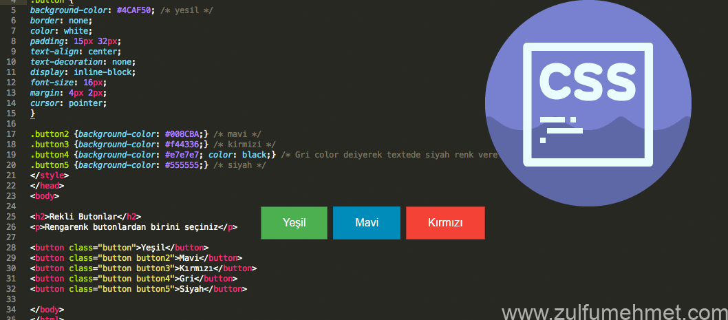
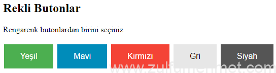
Örnek – 2 : Şimdi de birkaçtane buton ekleyelim ve renklendirelim butonlarımızı.
<!DOCTYPE html>
<html>
<head>
<style>
.button {
background-color: #4CAF50; /* yesil */
border: none;
color: white;
padding: 15px 32px;
text-align: center;
text-decoration: none;
display: inline-block;
font-size: 16px;
margin: 4px 2px;
cursor: pointer;
}

.button2 {background-color: #008CBA;} /* mavi */
.button3 {background-color: #f44336;} /* kirmizi */
.button4 {background-color: #e7e7e7; color: black;} /* Gri color deiyerek texte renk verelim */
.button5 {background-color: #555555;} /* siyah */
</style>
</head>
<body>

<h2>Rekli Butonlar</h2>
<p>Rengarenk butonlardan birini seçiniz</p>

<button class="button">Yeşil</button>
<button class="button button2">Mavi</button>
<button class="button button3">Kırmızı</button>
<button class="button button4">Gri</button>
<button class="button button5">Siyah</button>

</body>
</html>
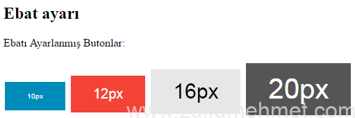
Örnek – 3 : Butonumuzun içinde bulunan textlerin ebatlarını ayarlayalım.
<!DOCTYPE html>
<html>
<head>
<style>
.button {
background-color: #4CAF50; /* yesil */
border: none;
color: white;
padding: 15px 32px;
text-align: center;
text-decoration: none;
display: inline-block;
font-size: 16px;
margin: 4px 2px;
cursor: pointer;
}

.button2 {font-size: 10px; background-color: #008CBA;} /* mavi */
.button3 {font-size: 20px; background-color: #f44336;} /* kirmizi */
.button4 {font-size: 30px; background-color: #e7e7e7; color: black;} /* Gri color diyerek texte renk verelim */
.button5 {font-size: 40px; background-color: #555555;} /* siyah */

</style>
</head>
<body>

<h2>Text ebat ayarı</h2>
<p>Text ebatı Ayarlanmış Butonlar:</p>

<button class="button button2">10px</button>
<button class="button button3">12px</button>
<button class="button button4">16px</button>
<button class="button button5">20px</button>

</body>
</html>
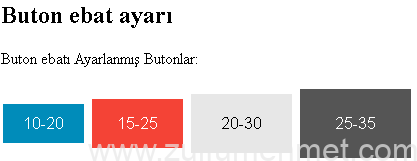
Örnek – 4 : Butonumuzun ebatlarını aşağı sağa sola büyüklüklerini ayarlayalım.
<!DOCTYPE html>
<html>
<head>
<style>
.button {
background-color: #4CAF50; /* yesil */
border: none;
color: white;
text-align: center;
text-decoration: none;
display: inline-block;
font-size: 16px;
margin: 4px 2px;
cursor: pointer;
}

.button2 {padding: 10px 20px; background-color: #008CBA;} /* mavi */
.button3 {padding: 15px 25px; background-color: #f44336;} /* kirmizi */
.button4 {padding: 20px 30px; background-color: #e7e7e7; color: black;} /* Gri color diyerek texte renk verelim */
.button5 {padding: 25px 35px; background-color: #555555;} /* siyah */

</style>
</head>
<body>

<h2>Buton ebat ayarı</h2>
<p>Buton ebatı Ayarlanmış Butonlar:</p>

<button class="button button2">10-20</button>
<button class="button button3">15-25</button>
<button class="button button4">20-30</button>
<button class="button button5">25-35</button>

</body>
</html>
Örnek – 5 : Butonumuzun kenarlarını ovalleştirerek güzel bir görünüm elde edelim.
<!DOCTYPE html>
<html>
<head>
<style>
.button {
background-color: #4CAF50; /* yesil */
border: none;
color: white;
padding: 15px 32px;
text-align: center;
text-decoration: none;
display: inline-block;
font-size: 16px;
margin: 4px 2px;
cursor: pointer;
}
.button2 {border-radius: 2px; background-color: #008CBA;} /* mavi */
.button3 {border-radius: 20px; background-color: #f44336;} /* kirmizi */
.button4 {border-radius: 30px; background-color: #e7e7e7; color: black;} /* Gri color diyerek texte renk verelim */
.button5 {border-radius: 50%; background-color: #555555;} /* siyah - degeri % olarak kullandıgımızda komple oval yapar */
</style>
</head>
<body>
<h2>Kenarlık oval ayarı</h2>
<p>Kenar oval Ayarlanmış Butonlar:</p>
<button class="button button2">10-20</button>
<button class="button button3">15-25</button>
<button class="button button4">20-30</button>
<button class="button button5">25-35</button>
</body>
</html>
<img class="alignnone wp-image-1488" src="https://www.zulfumehmet.com/wp-content/uploads/2017/04/ornek5_nsxzz3-1.png" width="450" height="139" />
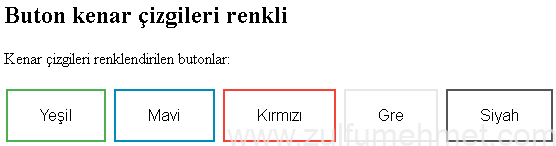
Örnek - 6: Son olarak butonun kenar çizgilerini boyayalım ve içi beyaz kalsın.
<!DOCTYPE html>
<html>
<head>
<style>
.button {
background-color: #4CAF50; /* yesil */
border: none;
color: white;
padding: 15px 32px;
text-align: center;
text-decoration: none;
display: inline-block;
font-size: 16px;
margin: 4px 2px;
cursor: pointer;
}
.button1 {background-color: white; /*buton ic renk */ color: black; /*yazi rengi */ border: 2px /* cizgi kalinligi */ solid #4CAF50; /*cizgi rengi */}
.button2 {background-color: white; /*buton ic renk */ color: black; /*yazi rengi */ border: 2px /* cizgi kalinligi */ solid #008CBA; /*cizgi rengi */}
.button3 {background-color: white; /*buton ic renk */ color: black; /*yazi rengi */ border: 2px /* cizgi kalinligi */ solid #f44336; /*cizgi rengi */}
.button4 {background-color: white; /*buton ic renk */ color: black; /*yazi rengi */ border: 2px /* cizgi kalinligi */ solid #e7e7e7; /*cizgi rengi */}
.button5 {background-color: white; /*buton ic renk */ color: black; /*yazi rengi */ border: 2px /* cizgi kalinligi */ solid #555555; /*cizgi rengi */}
</style>
</style>
</head>
<body>
<h2>Buton kenar çizgileri renkli</h2>
<p>Kenar çizgileri renklendirilen butonlar:</p>
<button class="button button1">Yeşil</button>
<button class="button button2">Mavi</button>
<button class="button button3">Kırmızı</button>
<button class="button button4">Gre</button>
<button class="button button5">Siyah</button>
</body>
</html>
Yukarıda gördüğünüz 6 örnekle web sayfamızda kullanacağımız butonlara nasıl şekil verebildiğimize değindik. Bunları kendi isteğinize göre şekillendirebilirsiniz.
Örnekleri indirmek için http://res.cloudinary.com/dihlkbitw/raw/upload/v1491227511/css-buton_daufks.rar
Kolay gelsin.

